In this workshop, we practiced writing a script to use in our studio shoot workshop.
I wrote the script above as an example of how we could script the package to appeal to our younger audience. The intro is still too formal, but I was happier with how I scripted the explanation of copyright.
I need to lighten up the tone more so that it's not so heavy for the younger audience to understand but it's not too simple.
We then could use this script in our next workshop, however I ended up re-writing a section in order to use something that fit the auto-cue better, and it flowed a lot easier. I preferred the introduction that I rewrote to what is written here, as it was better suited to the younger audience.
To begin, we shot a 'studio' sequence in front of a green screen. This helped us understand lighting for green screen, and also to learn how to use an autocue.
Using the autocue was a great learning curve, as it was much harder than you might expect. It took a lot of practice, and adjusting of the speed and text size until I was reading at a normal and understandable pace. I still think it could be slower.
It was also difficult to have to stand very still while talking as I'm naturally a very fidgety person, but the outcome was a lot better when I was more conscious of my body and face movements/ expressions. I was trying to project a friendly and interesting character to the viewer.
Thinking about all of these aspects of being in front of the camera was difficult but after much practice I was able to settle into it. It really helped to have Ebony and Esme in the crew guiding me in how to act and what might look better. It also became much simpler when I started to learn the script.
The lighting also turned out very well and I was surprised at how little overspill of green from the green screen that you can see in the final product.
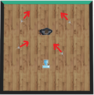
 I made a mock-up of the lighting position that we used when filming in front of the green screen. We had 2 lights facing at an angle towards the green screen- this flattened out the green screen to make the editing easier. We then had the lighting on the subject. One light was more direct onto the subject acting as a fill light, and the final light acted as a key light to the left of the subject, almost on a right angle from the subject. This makes the subject look less flat with subtle highlights and shadows to the face.
To avoid green overspill it was important to have some distance between the subject, the green screen and the green screen lights. The subject was in front of the green screen lights which helped to avoid overspill.
Overall this practice really helped to understand how difficult it is to work in front of a camera in a studio but I'm also really glad I could have the practice so I know what to expect from the real thing.
I wrote the script above as an example of how we could script the package to appeal to our younger audience. The intro is still too formal, but I was happier with how I scripted the explanation of copyright.
I need to lighten up the tone more so that it's not so heavy for the younger audience to understand but it's not too simple.
We then could use this script in our next workshop, however I ended up re-writing a section in order to use something that fit the auto-cue better, and it flowed a lot easier. I preferred the introduction that I rewrote to what is written here, as it was better suited to the younger audience.
Using the autocue was a great learning curve, as it was much harder than you might expect. It took a lot of practice, and adjusting of the speed and text size until I was reading at a normal and understandable pace. I still think it could be slower.
It was also difficult to have to stand very still while talking as I'm naturally a very fidgety person, but the outcome was a lot better when I was more conscious of my body and face movements/ expressions. I was trying to project a friendly and interesting character to the viewer.
Thinking about all of these aspects of being in front of the camera was difficult but after much practice I was able to settle into it. It really helped to have Ebony and Esme in the crew guiding me in how to act and what might look better. It also became much simpler when I started to learn the script.
The lighting also turned out very well and I was surprised at how little overspill of green from the green screen that you can see in the final product.
 I made a mock-up of the lighting position that we used when filming in front of the green screen. We had 2 lights facing at an angle towards the green screen- this flattened out the green screen to make the editing easier. We then had the lighting on the subject. One light was more direct onto the subject acting as a fill light, and the final light acted as a key light to the left of the subject, almost on a right angle from the subject. This makes the subject look less flat with subtle highlights and shadows to the face.
To avoid green overspill it was important to have some distance between the subject, the green screen and the green screen lights. The subject was in front of the green screen lights which helped to avoid overspill.
Overall this practice really helped to understand how difficult it is to work in front of a camera in a studio but I'm also really glad I could have the practice so I know what to expect from the real thing.
Comments
Post a Comment